Before the election, I heard Zogby say that the biggest predictor of how someone will vote is whether that person is married or single (never married). This leaves out people who used to be married, but set that aside. It just makes my head spin that that is what really sets Bush voters from Kerry voters. I quote:
In a blue state, you are seven points more likely to be single, never married, and, let me tell you, we talk about a gender gap in politics, but it's minuscule compared to the married-single gap.Of course, correlation is not causation, but that didn't stop someone from trying to correlate red states with low IQ, which was then debunked. Then someone correlated red states with generosity. I also saw a table showing that states with the highest mean income voted mostly for Kerry, but I can't find it again, so you don't get the benefit of a link.
I haven't even gotten to the fun part yet.
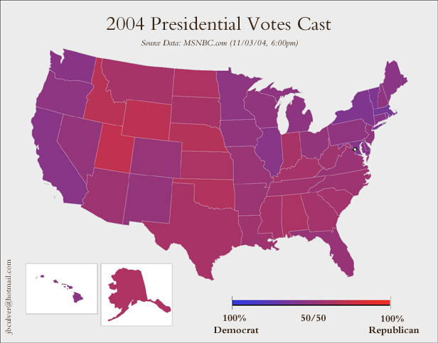
"Maps and cartograms of the 2004 US presidential election results" starts with the usual red/blue map one might see on a national news broadcast and then proceeds to twist that map in various ways, such as making the sizes of states on the map proportional to their populations. I also saw similar maps here, here, and here.
And finally, the biggest stretch from correlation to causation, a map comparing states that voted for Bush to states that had slaves before the Civil War.
No comments:
Post a Comment